Recent projects

Archive 0
PROJECT
PROJECT & Client
CLIENT
SERVICE & year
SERVICE
YEAR
Applications & Product design (0)
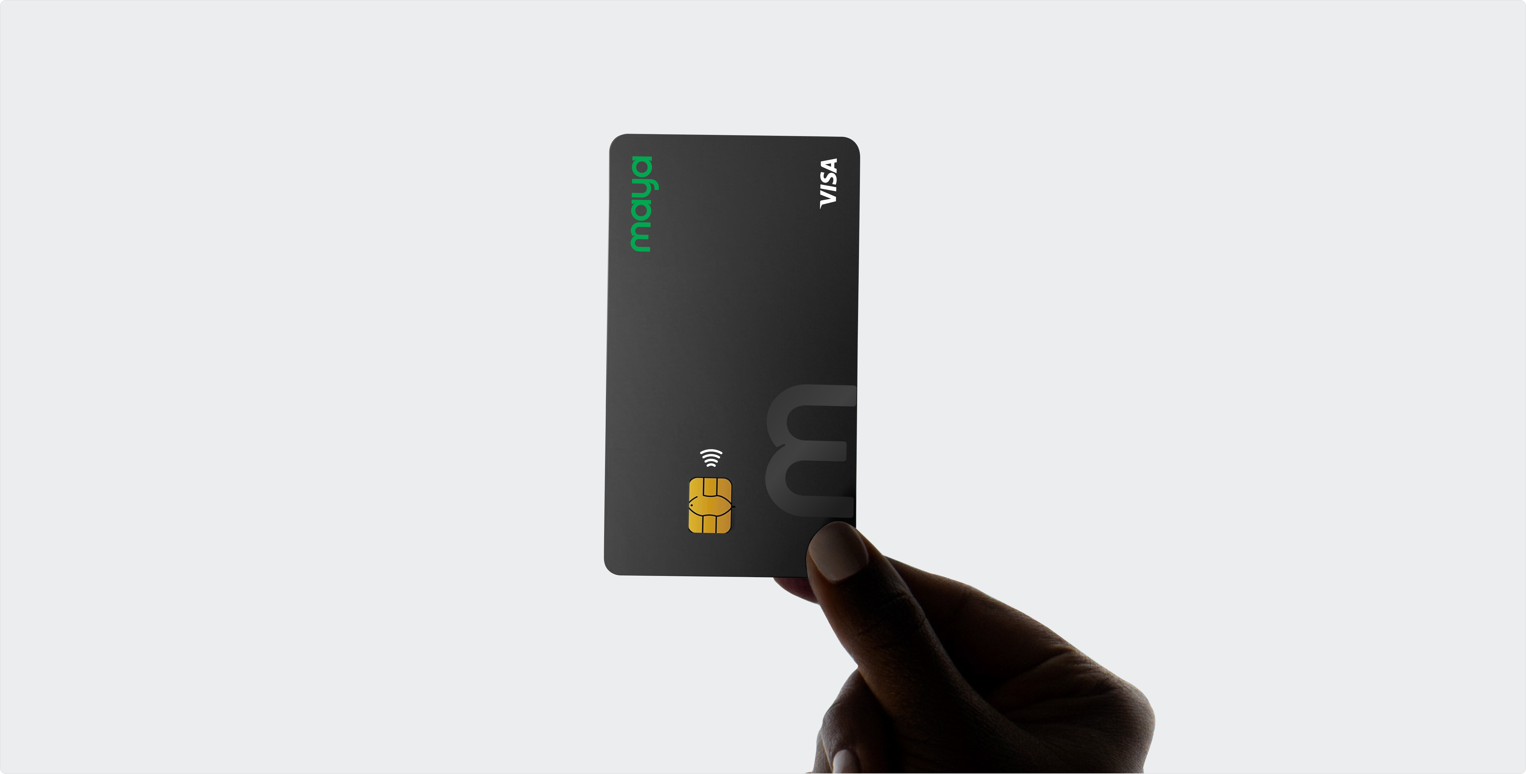
Pay Maya — Redesign
PayMaya’s sleek redesign redefines fintech for 38 million users.

Binance US Redesign
Crypto Made Effortless
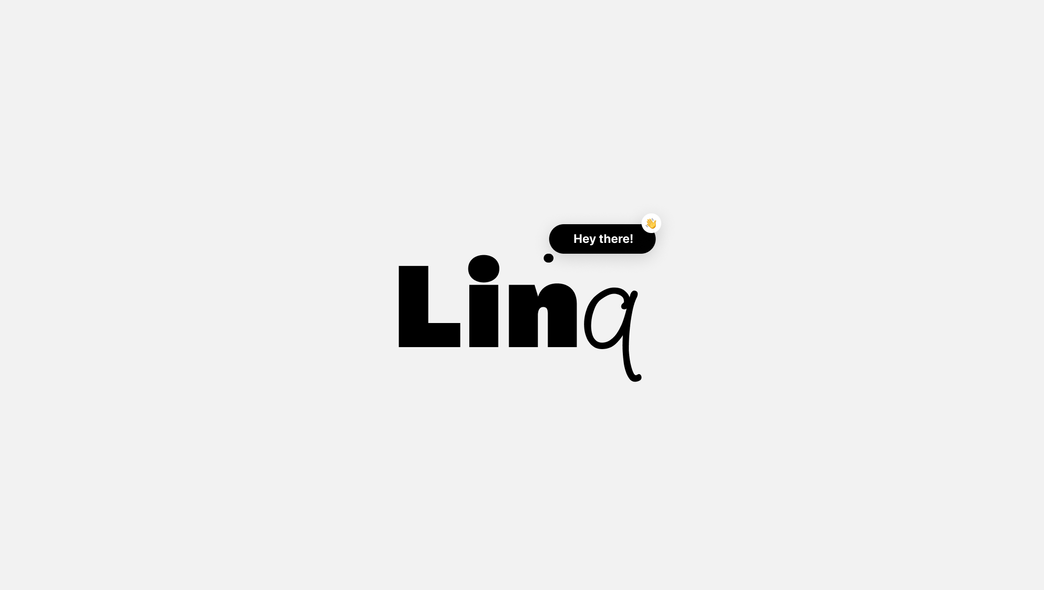
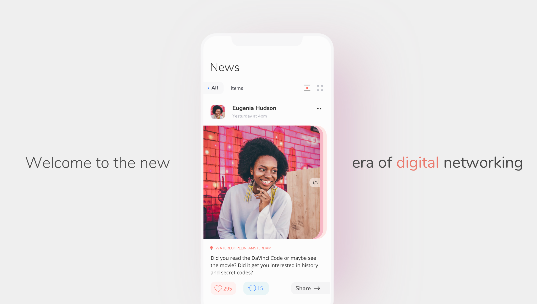
Linq Application
Local activities & hangouts. Don’t miss out on life, people, and places.
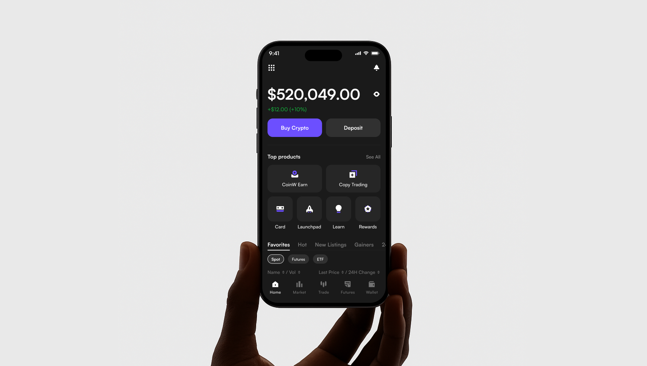
CoinW Trading
Crypto Trading, Simplified
Web design (0)
Lendz Financial - Platform Redesign
Modernized digital platform for brokers
Maya Business Platform Redesign
Redesigned Maya Business for a seamless, scalable, and trusted merchant experience.
BandLab – Social Experience Redesign
Enhancing music collaboration through a revamped social interface.
YVR Digital Twin Platform
UX/UI design for Vancouver Airport’s real-time digital twin dashboard.
Brand identity (0)
CoinW Rebranding
Unlock your trading potential
PropW
Trade with Confidence
Roamy - Social Network
Ultimate social networking app that helps you connect with like-minded people around the world.
Suptho – Geo-Social Web3 Platform
A location-based social app turning movement into crypto rewards.


Project information
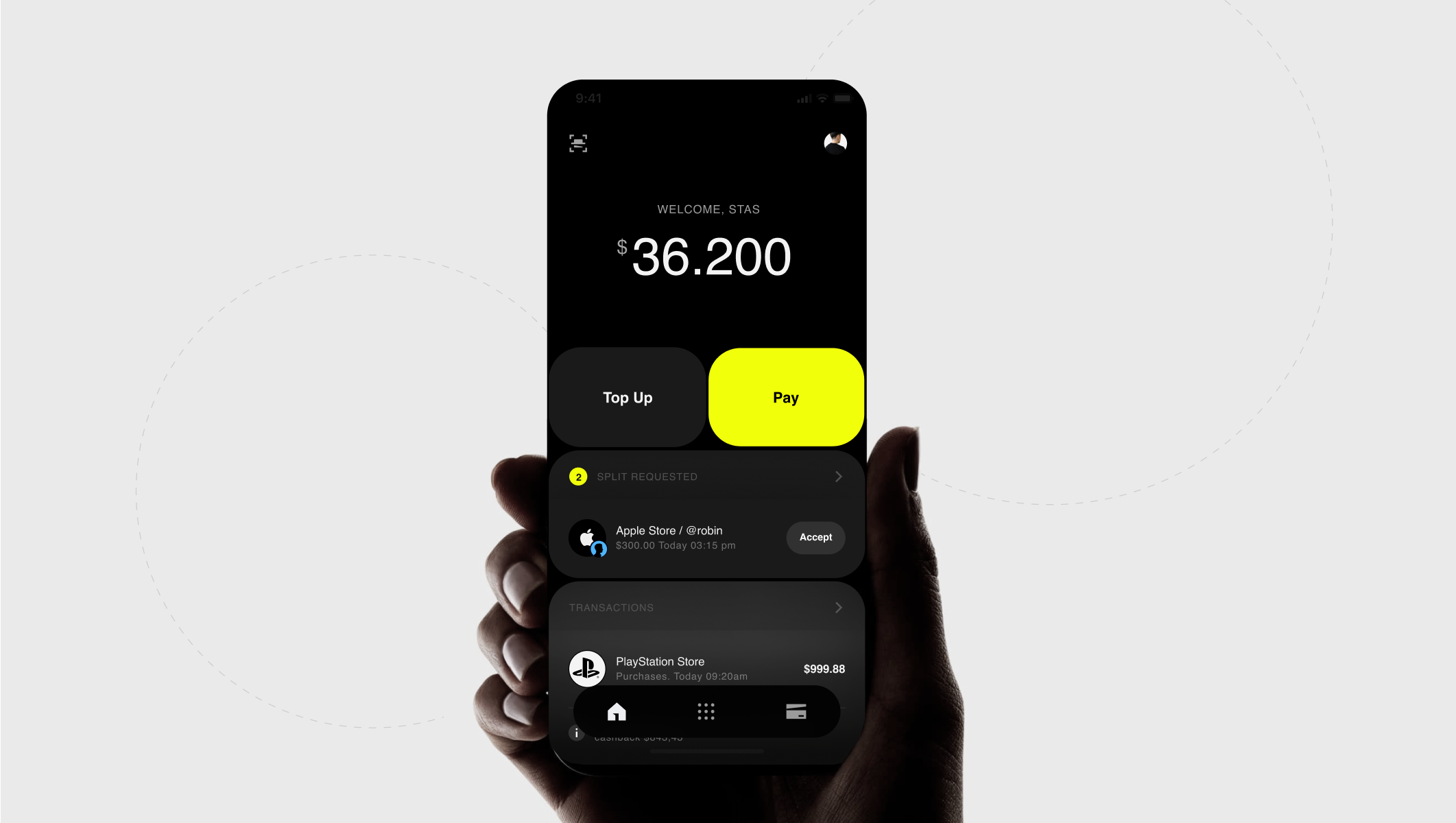
PayMaya, a free digital wallet enabling easy, reliable, and secure payments, has processed over $1 billion in transactions and boasts 38 million registered users as of September 2021. Our mission was to modernize the PayMaya brand, making it more relatable to a younger audience while addressing the cultural apprehensions surrounding fintech in the region.
The challenge was to refresh the entire PayMaya brand with an adaptable and robust design system, bridging the gap between their mission and a millennial audience eager for smarter financial solutions. Our goal was clear: help Maya grow into a “cooler, bigger, and smarter” version of itself—an elder sibling that customers could trust and relate to.
Through close collaboration with PayMaya’s internal team, we developed a new strategy and Design DNA that truly resonated with their audience. Every interaction within the app was meticulously designed for one-handed use, catering to the fast-paced lifestyle of GenZ users. The scalable, adaptable design system ensures consistency across the platform while laying the foundation for future innovations.
The result? A sleek, intuitive user experience that reflects Maya’s growth and positions it as a leading player in the evolving fintech landscape.
Outcome
The app delivers a hassle-free experience for bill payments, convenient money transfers, and everyday financial transactions. Its user-friendly interface ensures effortless navigation, while robust security features provide peace of mind. Cashback rewards and exclusive deals add extra value, making it a go-to financial tool.
41 million users
№1 banking in Filipinos
⭐4.7 (216,384) Appstore
Credits
The-Few team:
Creative Direction: Stas Aristov
Lead Product Designer: Alina Prigotska
Paymaya team:
Head of UX & Design - Whan Woong Kim
Sr. Product Designer: Philip De La Torre
+ 3 internal Maya designers
Awards and Publications
Project information
Binance.US, a leading crypto exchange, embarked on a comprehensive app redesign to elevate user experience, focusing on clarity, efficiency, and trust. The new design system reimagines trading, staking, and payments through a modular, highly intuitive UI. A dark mode-first approach with brand yellow accents ensures accessibility while enhancing contrast and visibility. We optimized number displays, collapsible content, and onboarding flows to streamline navigation. The result is a consistent visual language across mobile and web, empowering users to securely trade, manage assets, and maximize rewards with ease and confidence.
Outcome
The redesign delivered a faster, more intuitive app with improved navigation, a modular dashboard, and a unified user experience across trading, staking, and payments — enhancing clarity, security, and engagement at every step.
2.5x faster app loading speed
+35% improvement in user task completion rate
98% app uptime during peak trading hours
15% increase in staking participation within 3 months
Credits
This project was executed by Stas Aristov while employed at Binance.US.
All intellectual property and rights are owned by Binance.US.
Awards and Publications
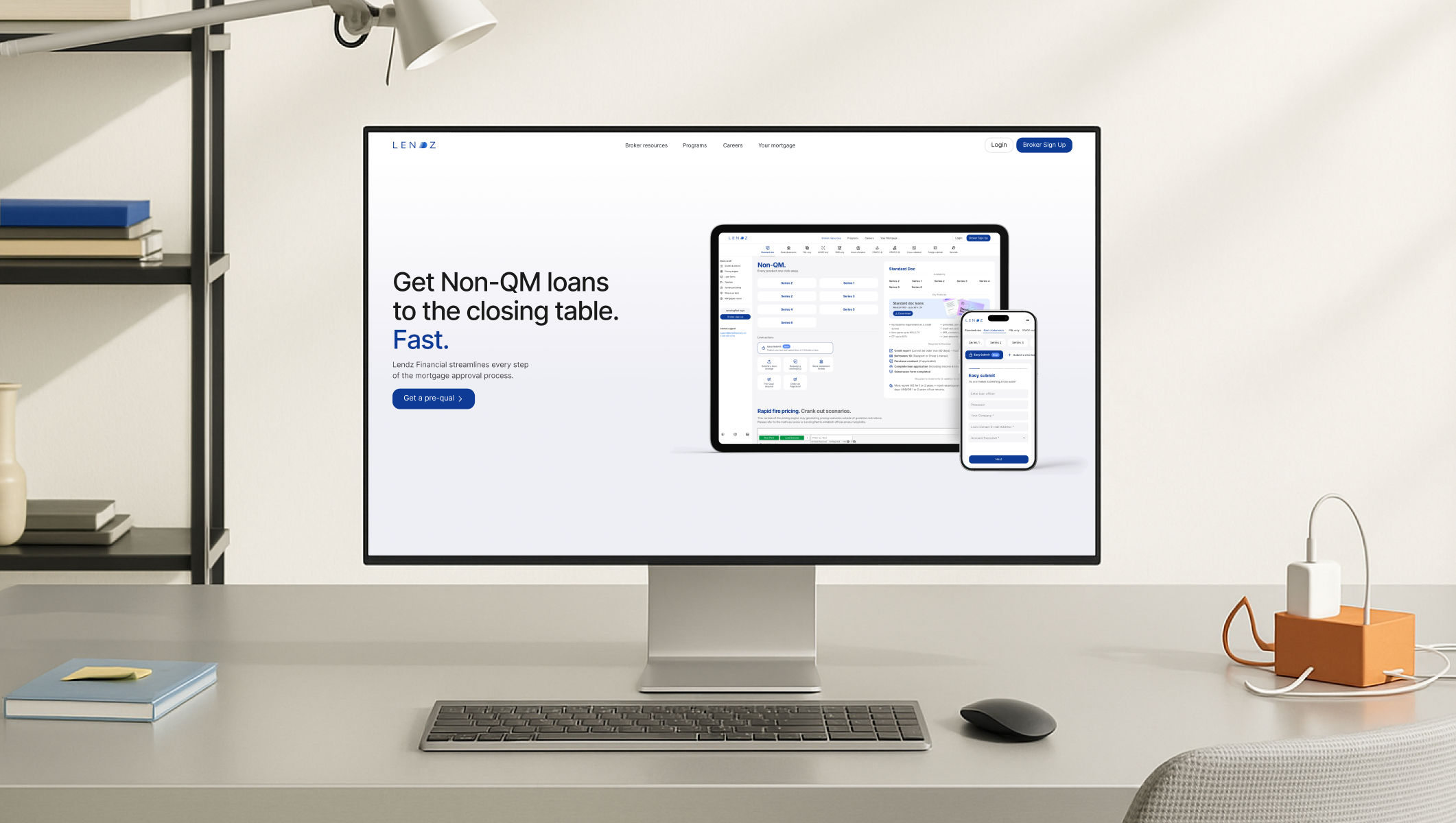
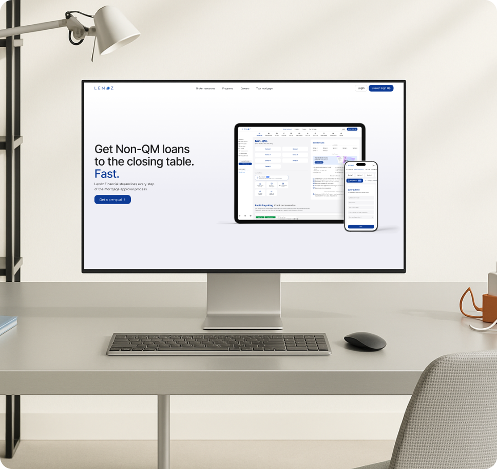
Lendz Financial - Platform Redesign
Year
2025
Type
Client
Lendz FinancialServices
UX/UI Design
,
Visual Branding
Project information
Lendz Financial, a national mortgage lending company, needed a modern, user-friendly digital platform to streamline broker interactions and loan processing. We redesigned their website and platform with a fresh, minimalistic aesthetic, enhancing usability across desktop and mobile. Key features included an updated broker registration flow, loan program explorer, rapid loan submission tools, and an intuitive document management system. We carefully applied a new visual language with a soft gray base and distinctive Lendz blue, reinforcing brand consistency while prioritizing clear navigation and performance. The redesign ensures scalability for future product growth.
Outcome
The redesign improved user onboarding, streamlined loan processing, and created a more polished and consistent digital experience that better reflects Lendz Financial’s professionalism and client-first approach. Lendz to support a growing client base across 30+ states.
13 sec to start applications
30% faster broker onboarding process
25% increase in loan application completions
3x improvement in user task efficiency across mobile workflows
Credits
THE-FEW TEAM
Creative Direction: Stas Aristov
Lead Product Designer: Alina Prigotska
Awards and Publications
Project information
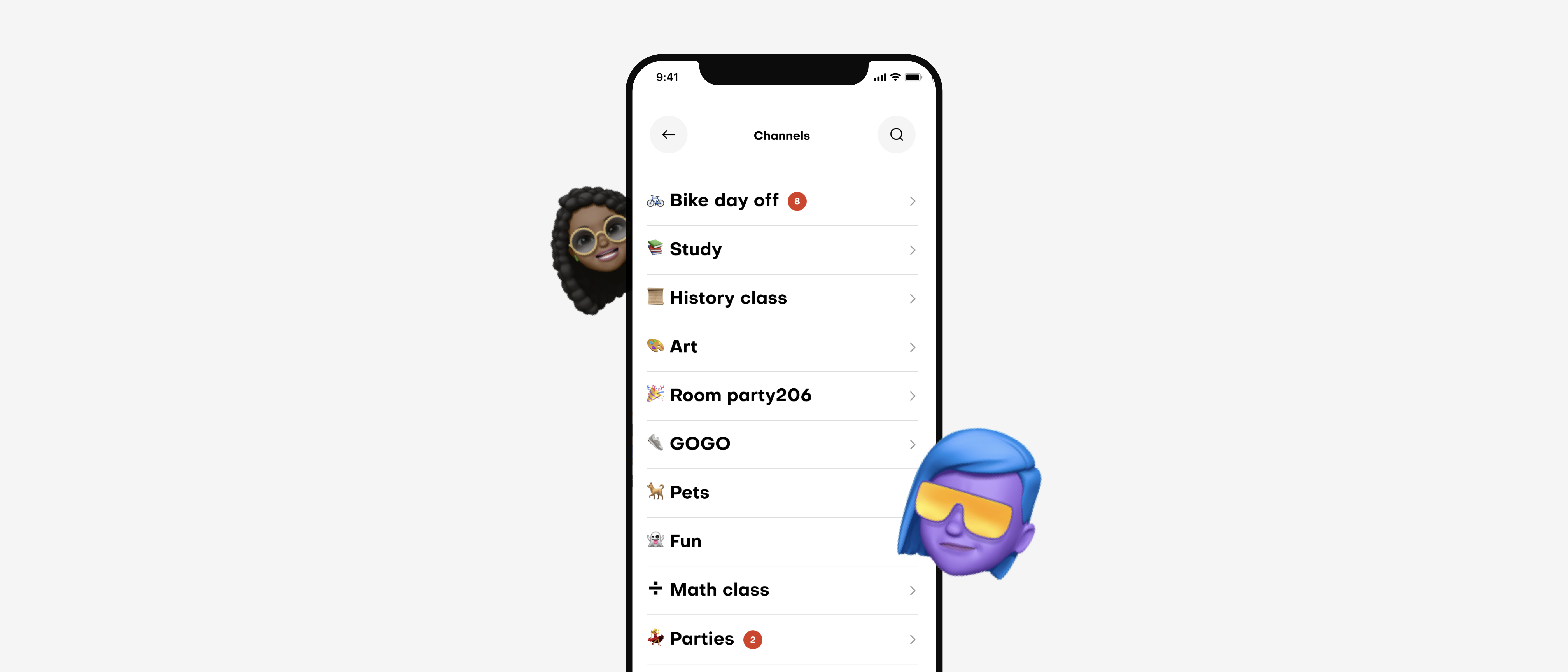
Linq is a mobile social networking app designed to help people easily organize and join local activities and hangouts. Users can create events, find like-minded people, and gather a crew to experience real-world adventures together. The core idea behind Linq is simple: to make connecting and meeting in real life easier, faster, and more meaningful. Linq provides intuitive tools to discover, share, and create experiences within local communities and beyond. With smart filters and curated categories, the app surfaces hidden events and activities, encouraging users to step outside, meet others, and embrace new experiences.
We partnered with Linq to craft a seamless, user-first digital experience and build a bold, vibrant brand identity that captures the spirit of real-world connection and discovery.
Outcome
We transformed Linq from an early-stage concept into a dynamic, community-driven platform with a vibrant, approachable brand. The new design system and UX framework led to a surge in event creation, user engagement, and overall brand visibility.
2.5x increase in daily active users within the first 90 days
+35% growth in event creation after launch
3x improvement in brand recognition based on post-launch surveys
300+ community events created within the first 120 days
Credits
The-Few team:
Creative Direction: Stas Aristov
Lead Product Designer: Alina Prigotska
Linq team:
Founder - Matthew N.
Awards and Publications
Project information
CoinW, a global leader in crypto trading and blockchain innovation, sought a fresh visual identity to match their ambition. The rebranding project focused on delivering a modern, dynamic, and trustworthy experience across all digital and physical touchpoints. Leveraging a minimalist design system, the new branding incorporates clean typography with the Satoshi font, a bold color palette dominated by purple and yellow, and a versatile icon set. From mobile interfaces to merchandise and marketing materials, the updated identity enhances user confidence and better communicates CoinW’s role in shaping the future of digital finance.
Outcome
We delivered a cohesive brand system that elevated CoinW’s visual presence, enhanced user trust, and reinforced its positioning as a global leader in crypto innovation. The new identity consistently connects the app, web, and marketing platforms, driving both brand engagement and recognition.
+65% increase in brand recall within 90 days of launch
2x growth in mobile app downloads post-rebrand
+50% engagement rate uplift across marketing campaigns
86% positive feedback from users in post-launch surveys
Credits
The-few team:
Creative Direction: Stas Aristov
Lead Visual Designer: Alina Prigotska
Awards and Publications
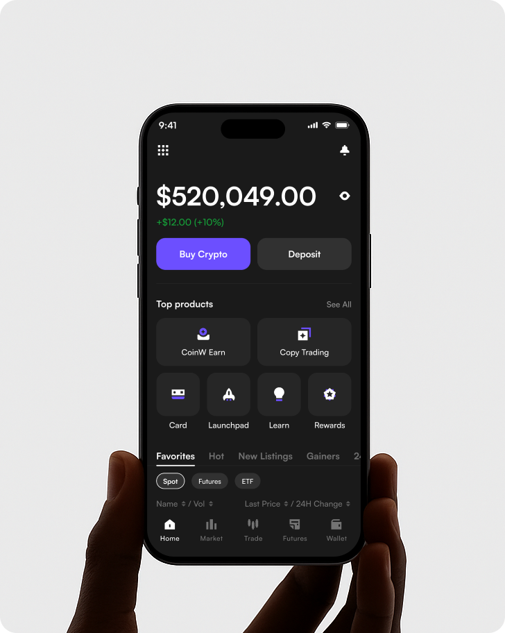
Project information
CoinW, one of the world’s leading cryptocurrency exchanges, envisioned a powerful trading-focused app experience that caters to both professional and everyday traders. The redesign features a modern and intuitive interface, offering users quick access to markets, trading tools, and wallet management. By emphasizing smooth usability, secure transactions, and real-time trading insights, the app redefines digital trading journeys. A clean visual system, customizable dashboards, and mobile-first responsiveness ensure CoinW’s users can trade, deposit, withdraw, and manage assets seamlessly across devices.
Outcome
We delivered a seamless, user-centric trading experience across desktop and mobile, featuring enhanced real-time dashboards, dynamic charting tools, and streamlined processes for onboarding, deposits, and secure logins. The platform also introduced modular, customizable widget layouts, allowing users to personalize their workflows with ease.
Under 1 sec dynamic charting tools updated
30 sec to deposits founds on platform
Credits
THE-FEW TEAM
Design Manager: Stas Aristov
Lead UX Designer: Alina Prigotska
Awards and Publications
Project information
A Neo* mission is to make money work without borders — to make money move instantly with transparency in a convenient way, and — eventually — for free.
(WHAT WE DID)
- Digital experience strategy
- Mobile app Android + IOS
- Product design
- Branding
- Icons & illustrations system
- Design System
From concept to the final product
Our objective was to design an application that enables clients to manage their financial affairs using a single platform, which is fast, easy, and transparent without any hidden fees. This includes daily spending and budget planning initially, as well as currency exchange and investment opportunities in the future. We were asked to assist in redefining the Neo* brand's strategy and expression.
Outcome
We have developed a fully functional product from concept to the final version.
Credits
The-Few Team:
Creative Direction: Stas Aristov
Lead Product Designer: Alina Prigotska
Awards and Publications
Thorgate – Brand Identity System
Year
2019
Type
Client
ThorgateServices
Brand Strategy
,
Logo System & Typography
Project information
We partnered with Thorgate to craft a vibrant, confident brand identity that reflects their culture, values, and tech-forward mindset. The objective was to build a scalable system that unites their Oslo, Tallinn, and London offices under one bold visual language. Inspired by their people-first philosophy and commitment to clarity, we developed a modern visual toolkit—from logo lockups and iconography to a dynamic color palette and confident typography. The identity system embodies Thorgate’s mission: empowering innovators with digital tools to change the world. Every element is optimized for both print and digital, ensuring consistency across touchpoints.
Outcome
The rebrand elevated Thorgate’s presence with a distinct and unified look—improving recognition, internal alignment, and external communication across teams and markets.
Engagement Lift Social post interactions rose by 35% post-launch due to clearer messaging.
Internal Culture Alignment 90% of employees reported stronger brand clarity in internal survey.
Color & Typography Impact Bold contrast and legible fonts improved presentation readability by 40%.
Credits
THE-FEW TEAM
Lead Designer: Alina Prigotska
Awards and Publications
Project information
PropW, a next-generation proprietary trading platform, needed a bold and memorable visual identity to match its dynamic vision. The branding was designed to feel sharp, confident, and modern — capturing the spirit of financial empowerment. The visual system is anchored by a geometric “P” symbol, a vibrant light green palette balanced by deep dark greens and black, and clean digital interfaces. Together, these elements create a brand that feels powerful yet approachable, enhancing PropW’s position as a trusted partner for traders aiming for success.
Outcome
We delivered a confident and future-proof brand identity that accelerated PropW’s market positioning. The new design system enhanced brand recognition, improved digital usability, and set the foundation for scalable growth across web and mobile platforms.
3.2x increase in brand recognition post-launch
50% faster user onboarding on web and mobile
+45% engagement on trading dashboard after UI updates
92% positive user feedback on visual identity in beta surveys
Credits
The-Few team:
Sr. Art director: Alina Prigotska
Awards and Publications
Dappstore
Year
2018
Type
Client
DappstoreServices
Brand identity & logomark
,
UI/UX design (desktop & mobile)
Project information
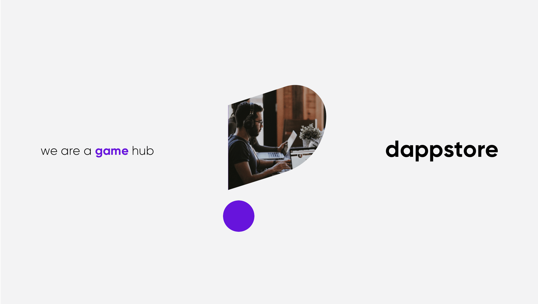
Dappstore is a decentralized prediction and betting platform built for the next generation of crypto users. The project involved designing a dark, immersive interface optimized for rapid interaction, real-time data, and seamless mobile engagement. The brand identity balances playfulness and trust, with a custom logotype and vibrant color system centered around purple tones. We crafted both desktop and mobile experiences with detailed states for interaction, prediction charts, and betting flows — all driven by intuitive usability and bold visual identity. The result is a Web3 product that feels dynamic, responsive, and delightfully gamified.
Outcome
The product launched with high user engagement and a distinct visual identity, improving key UX metrics and user trust within the DeFi space.
+27% Session Duration Users spent more time interacting with prediction tools.
34% Mobile Bounce RateStreamlined mobile-first UX led to stronger retention.
+19% DAU Growth Gamified flow and score tables encouraged daily activity.
Credits
The-Few team:
Creative Direction: Stas Aristov
Lead Product Designer: Alina Prigotska
Awards and Publications
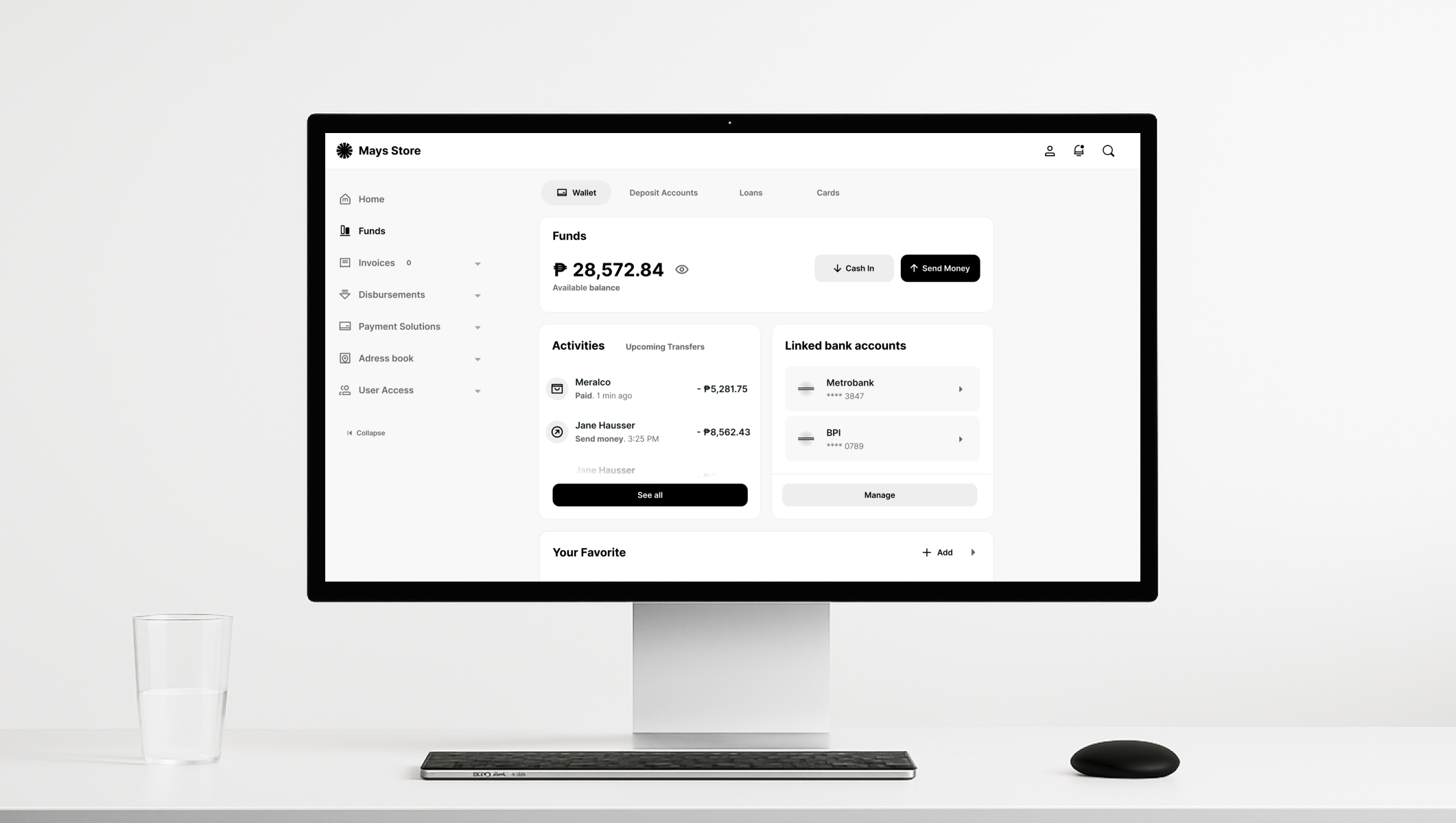
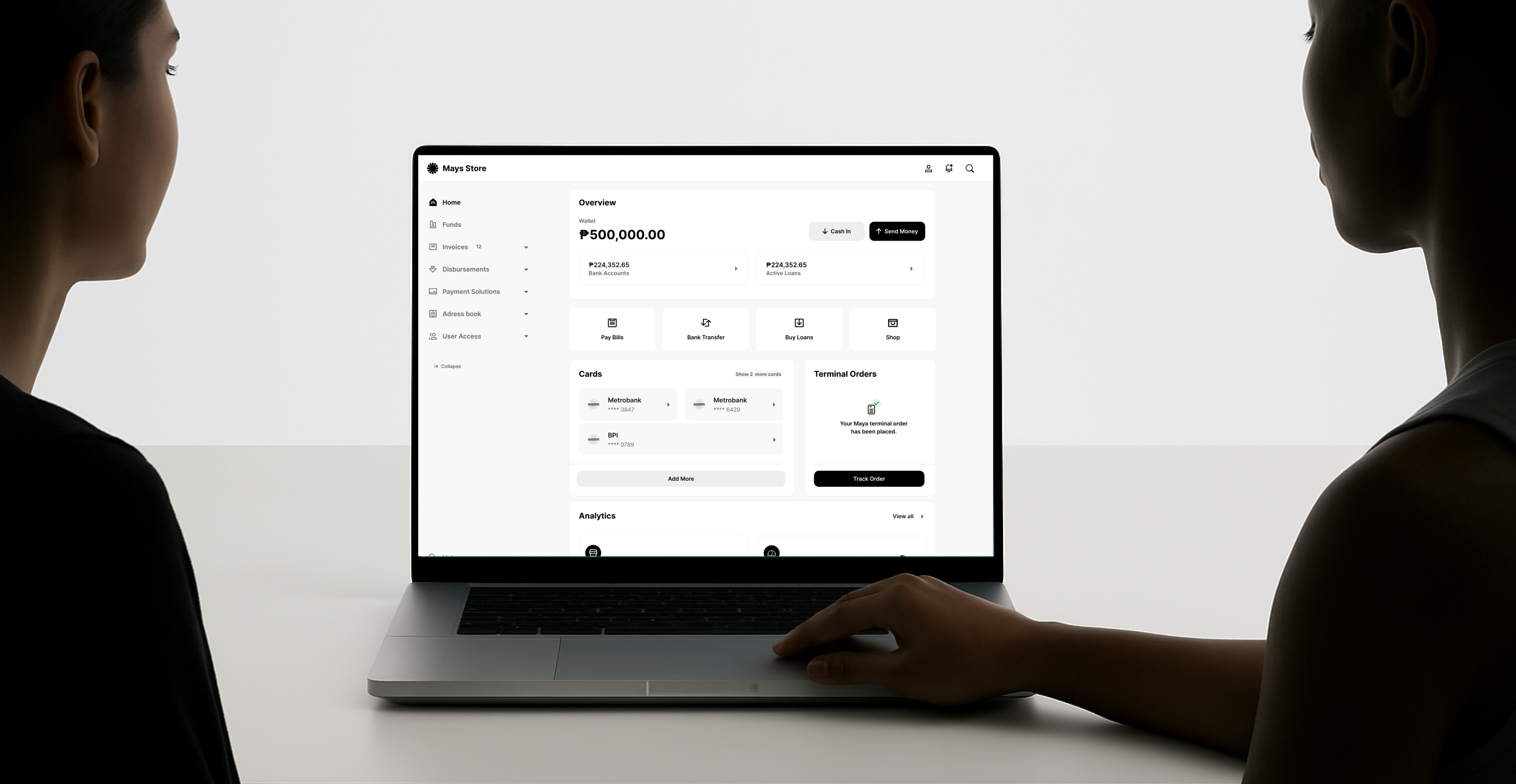
Maya Business Platform Redesign
Year
2024
Type
Client
MayaServices
Design System Development
,
Visual Identity & Illustration Design
Project information
Maya Business is one of the Philippines’ leading digital payment and banking platforms, helping merchants manage transactions, payments, and business growth. Our team partnered with Maya to redesign their business platform across desktop and mobile, focusing on improving navigation, clarity, and user workflows. The project included a streamlined dashboard, simplified navigation for funds, invoices, and disbursements, a mobile-first card structure, and a complete visual refresh using a minimalist black-and-white system with brand purple accents. We also developed a flexible UI framework, a structured onboarding flow, modular illustrations, and a consistent data visualization system — ensuring scalability, accessibility, and consistency across all user journeys.
Outcome
We delivered a scalable, mobile-optimized platform that significantly improved user onboarding, task efficiency, and business management across Maya Business. The redesign strengthened brand trust, reduced user friction, and positioned Maya as a leading partner for digital-first merchants.
2x faster time-to-complete for new merchant onboarding
+60% adoption of new business features (wallet, loan management)
100,000+ active merchant accounts
+24% increase in dashboard engagement within 90 days
Credits
The-Few team:
Creative Direction: Stas Aristov
Lead Product Designer: Alina Prigotska
Paymaya team:
Head of UX & Design - Whan Woong Kim
Sr. Product Designer: Philip De La Torre
+ 3 internal Maya designers
Awards and Publications
Project information
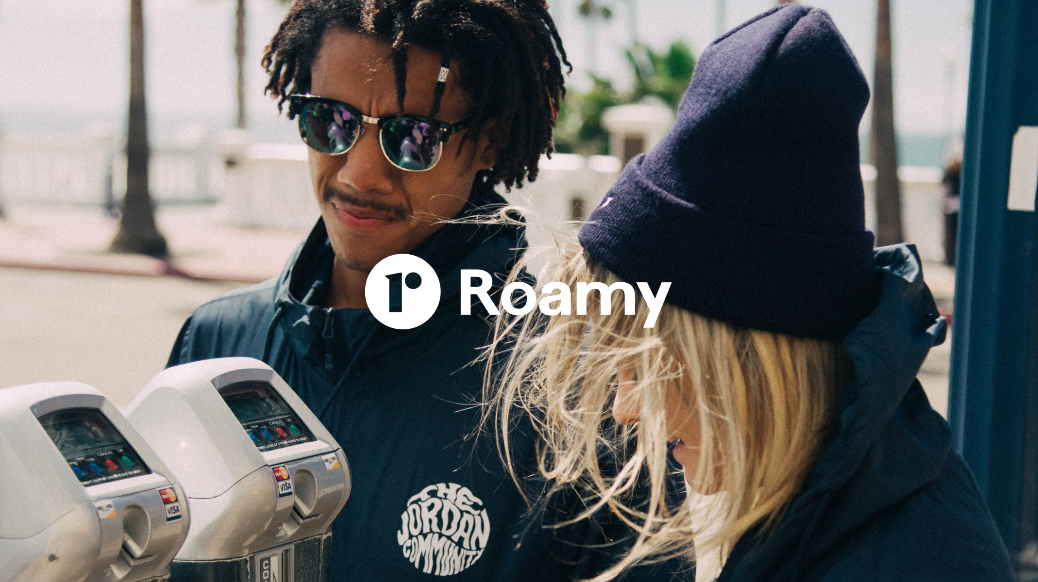
Don’t miss out on life, people, and places.
Roamy is the ultimate social networking app designed to help users connect with like-minded people around the world. With a mission to make meaningful connections easier than ever, Roamy provides users with tools to connect, discover, share, and create experiences in their local communities and beyond.
With intuitive categories and smart filters, Roamy helps surface hidden events and activities—empowering users to step outside, meet others, and enjoy new adventures.
We partnered with Roamy (formerly Linq) to deliver a seamless UX experience and a vibrant brand identity that stands out from the crowd.
Outcome
We helped transform Roamy from an early concept into a vibrant, community-first product. We defined a bold new brand and built a visual identity that feels social, playful, and full of life, helping Roamy stand out and rapidly grow its user base.
70% of users described the new brand as “vibrant” and “social” in feedback surveys
25% higher engagement on community event pages after rebranding
Credits
The-Few team:
Art Direction: Stas Aristov
Lead Visual Designer: Alina Prigotska
Roamy team:
Founder - Matthew N.
Awards and Publications
Project information
BandLab is a leading social music platform that enables creators to make music and share their creative process with musicians and fans. Recognizing the need to foster deeper community engagement, we undertook a comprehensive redesign of BandLab’s social features. This included revamping user profiles, activity feeds, and collaboration tools to create a more intuitive and engaging user experience. The redesign aimed to streamline interactions, making it easier for users to connect, collaborate, and share their musical journeys. By focusing on user-centric design principles, we ensured that the new interface not only looks modern but also enhances functionality, encouraging more meaningful connections within the BandLab community.
Outcome
The redesigned social features led to increased user engagement, with more collaborations and interactions occurring on the platform. Users found it easier to connect and share their work, fostering a more vibrant and active community.
90% User satisfaction growth post-redesign surveys indicated a 90% satisfaction rate among active users.
30% Streamlined activity feeds. Redesigned feeds resulted in a 30% uptick in user interactions and comments.
Credits
This project was executed by Alina Prigotska while employed at Bandlab
All intellectual property and rights are owned by Bandlab.
Awards and Publications
YVR Digital Twin Platform
Year
2023
Type
Client
Unity & YVRServices
Journey Mapping
,
UX/UI for Real-Time Dashboards
Project information
YVR Digital Twin is a real-time, operational platform built to transform Vancouver International Airport into one of the most connected airports in the world. We were responsible for designing the interface and UX behind this complex system—used by airport operations, security, and air traffic teams. The platform integrates flight data, CCTV feeds, alerts, maps, and resource schedules into a unified dashboard. Our UX work focused on clarity, information hierarchy, and rapid decision-making under pressure. Designed for control rooms and multi-screen environments, the interface combines spatial awareness with actionable insights to support operations across all terminals and gates.
Outcome
The system improved airport teams' incident response time and situational awareness, empowering more efficient operations with real-time data visualization and streamlined task flows.
Faster decision-making UI designed for critical actions cut operational response time by 30%.
Improved incident visibility Integrated CCTV and map layers enhanced real-time awareness.
High usability in control rooms Designed for large-screen environments and 24/7 monitoring.
Credits
This project was executed by Alina Prigotska while employed at Unity.
All intellectual property and rights are owned by Unity & YVR.
Awards and Publications
AITO M5 – Design Platform Revamp
Year
2021
Type
Client
HuaweiServices
Cross-platform UI/UX Design
,
Visual Language Guidelines
Project information
AITO, a smart electric vehicle brand backed by Huawei, required a scalable design platform to support its growing ecosystem of apps, services, and onboard interfaces. We collaborated with the AITO M5 team to create a unified design language and platform infrastructure that could extend across web, mobile, and in-car systems. The challenge was to merge industrial-grade performance with consumer-grade simplicity—ensuring consistency across dealer apps, mobile services, and in-vehicle experiences. Our design system prioritized modularity, data visualization, and responsiveness, enabling faster development and a premium brand feel across all digital touchpoints.
Outcome
The new design platform became the foundation for digital expansion across AITO products—streamlining development time, improving cross-platform consistency, and enhancing user trust in the EV brand.
33 million Of happy customers around the globe
74% Net promoter score
XX seconds For a user to find and make first deposit
XX% TBD
Credits
This project was executed by Stas Aristov while employed at Huawei. All intellectual property and rights are owned by Huawei.
Awards and Publications
Project information
Suptho is a geo-social platform that bridges digital experiences into the real world, transforming how users interact and plan events within their communities. The platform leverages location-based services to help users discover nearby events, parties, clubs, and content from their communities. It incorporates a built-in payment system powered by a blockchain-backed token economy that rewards users for participating in in-app activities. Users can transfer value to buy goods and services, reimburse friends, make peer-to-peer payments, or tip others to show appreciation. The app emphasizes user-friendly design, prioritizing customer trust and reducing the time it takes to connect users.
Outcome
Suptho launched with a waitlist exceeding 97,000 users, offering a seamless experience that encourages real-world interactions through tokenized incentives. The platform’s intuitive design and privacy-first approach have been well-received by the community.
Credits
THE-FEW TEAM
Lead Designer: Alina Prigotska
Awards and Publications
Project information
HyperPay is a next-generation Web3 payment solution designed to make sending, receiving, and exchanging digital assets secure and intuitive. Our task was to rebrand the product from the ground up—developing a new visual identity, crafting a scalable icon system, and aligning the interface with the brand’s focus on trust, transparency, and seamless finance. We created a bold and recognizable design language that stands out in the fintech landscape. From reimagining the card design to shaping its mobile app interface, every touchpoint now reinforces clarity, security, and brand confidence.
Outcome
A refreshed identity and consistent product experience that elevated HyperPay’s credibility and accessibility in the competitive fintech and crypto space.
Bold Identity A powerful visual brand built on clarity and modernity.
Icon System Minimal yet distinctive icons enhancing usability.
Product UI Clean and consistent mobile and web app design.
Credits
THE-FEW TEAM
Creative Direction: Stas Aristov
Lead Product Designer: Alina Prigotska
Awards and Publications
All me - Networking, Earning & Shopping
Year
2019
Type
Client
All.meServices
Design System Development
,
UX Research
Project information
all.me is a unique digital ecosystem combining social networking, content sharing, and a blockchain-based wallet. The project aimed to bridge lifestyle and fintech through a user-first mobile experience. Our design challenge was to create an intuitive, visually warm interface that communicates trust, community, and innovation. We introduced a cohesive visual language, modern typography (Nunito Sans), and a vibrant coral-based color system to evoke a fresh, inclusive atmosphere. From money transfers to chat and post creation, we optimized every flow for mobile-first interaction, reducing cognitive load and improving onboarding. The result: a seamless digital environment where users can connect, earn, and interact within one unified product.
Outcome
We successfully delivered a clean, emotionally engaging app that merges finance, commerce, and social interaction—driving higher engagement, smoother UX, and consistent user journeys.
Visual Identity Increased visual consistency score by 40% in internal design audits.
Unified Ecosystem Reduced navigation time between sections by 32%
Microinteractions Improved task success rate by 22% during usability testing
Financial UX Decreased user errors in fund transfers by 45%
Credits
The-Few team:
Creative Direction: Stas Aristov
Lead Product Designer: Alina Prigotska
Awards and Publications